
Tethered Balloon
Experiment
Data Analysis
Our experiment involved lofting a Labpro data logger and 3 probes using
a 6 ft diameter helium weather balloon tethered with a 1000 ft of nylon
twine.
1 Barometer
2 Stainless Steel Thermometer
3 Relative Humidity Sensor
Line was payed out in 100 ft stages, pausing about 5 minutes at each stage. Data was collected each second throughout the flight. The altitude was calculated using the length of line and its angle from zenith.
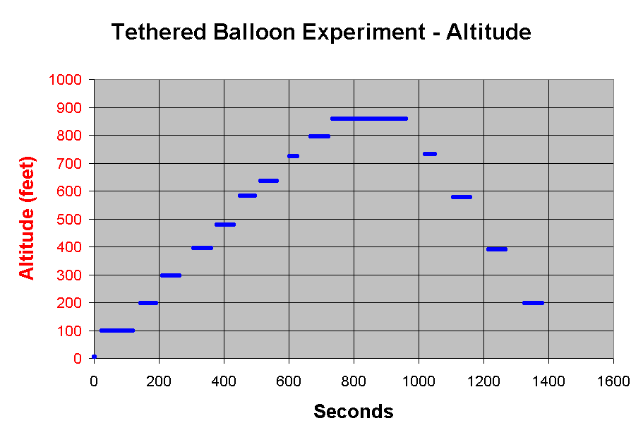
This plot of altitude shows the basic flight plan. Stronger air movement
aloft caused the ballon to drift sideways more and more as it went up.
At 1000 ft of line the balloon was tilted over 31 degrees giving us a
maximum altitude of only 857 ft.
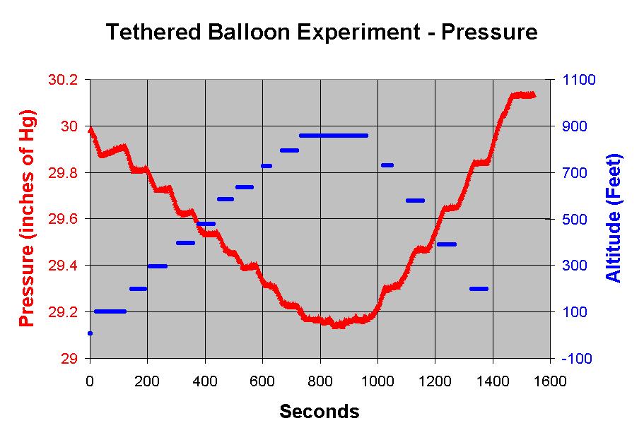
The pressure shows a very strong correlation with altitude. The pressure curve shows steps when the altitude curve steps. The pressure curve returns to its surface value when the balloon does. However, it does show a drift of about 0.13 in of Hg corresponding to about 75 feet of elevation.
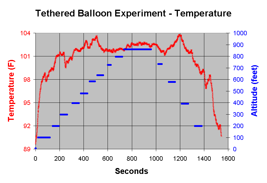
The temperature plot also shows a return to surface conditions. However, the lack of steps corresponding to the steps in altitude suggest that the probe was unable to reach equilibrium during the step. This may have been because the probe was too thermally isolated from the air or that the temperature was varying rapidly due to other conditions besides altitude.
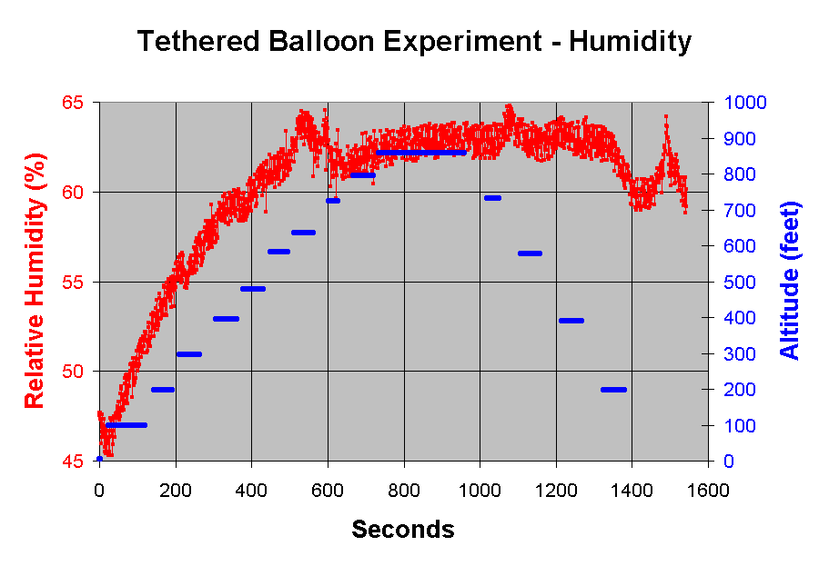
This plot of humidity is more problematic. At first it seems to increase with altitude although not reaching equilibrium during the steps. However, bringing the balloon back down had no corresponding effect.
Predicted Pressure & Temperature vs Measured
Using the "1976 Standard Atmosphere"
model as published by NOAA, NASA, & USAF; we can make standardized
predictions and then compare to actual measurements.
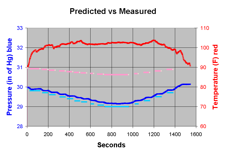
Red is measured temperature, pink is predicted temperature. Dark blue
is measured pressure, light blue is predicted pressure.
The measured pressure follows the prediction very closely.
However, the measured temperature is radically different even in shape
from the prediction. Air aloft was warmer, not cooler than the surface
air.
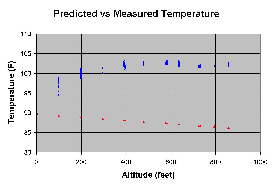
Plotting the temperature vs altitude (instead of time) shows this discrepancy more clearly. Blue points mark the measured temperatures while red marks the predictions.
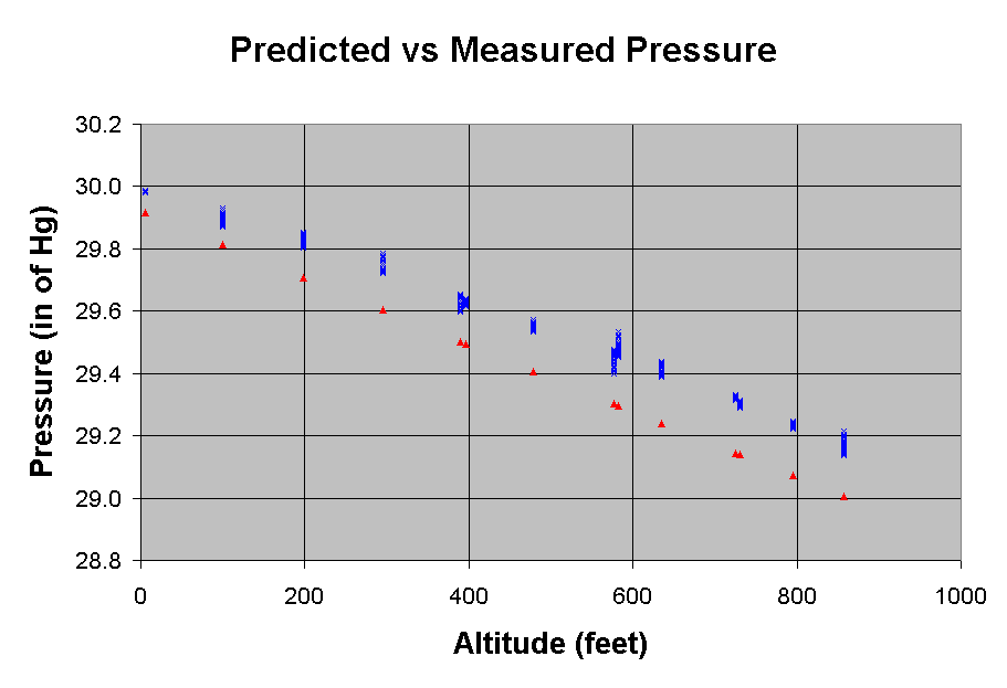
Again, plotting vs altitude shows how similar the measured pressure is to the prediction.