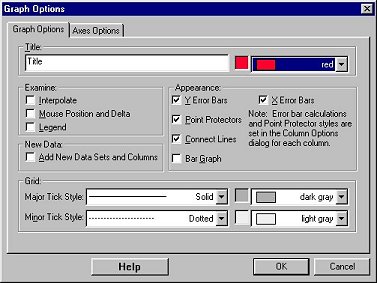
The Graph Options tab allows you to control how your data are plotted. The other tab, Axes Options, allows you to choose which data columns are plotted and how the graph is scaled. You can also bring up this box by double-clicking on the graph.
Tab Options
You can turn each of these options on or off as desired.
Title:
You can add and change the title text and its color as well as remove
the title completely. The title will be placed at the top of the graph.
Examine:
Interpolate: By moving the mouse along the curve, you can read values from the graph. The Interpolate function will be activated.
Mouse Position and Delta: A display of the current cursor position will be given.
Legend: Displays a legend using Data Column labels in the graph
window
New Data:
Whenever a data set or column is created, it will automatically be added
to the graph or table.
Appearance:
X and Y Error Bars: The ranges of error bars are defined by the raw values in the selected variables. The midpoints are represented by point markers. Set the styles in the Column Options Dialog.
Point Protectors: mark every Nth point with a point protector. Set the styles and the spacing between point protectors in the Column Options Dialog.
Connecting Line: connect data points with lines to create a continuous plotted line
Bar Graph: draw line from horizontal axis to points.
Grid:
Major and Minor Tick Style: select line style for grid lines
Major and Minor Tick Color: select grid line color
Click OK to make your selections take effect.
See also: