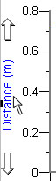
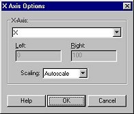
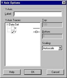
Click on an axis label to adjust which data columns are plotted. The x- or y-axis options dialog box will open. You can also adjust the plotted columns in the Graph Options dialog.
Here you can also adjust the axis scaling to one of these modes:
| Autoscale: | Graphical Analysis will choose an appropriate range for the axes based on the data being plotted. |
| Autoscale from 0: | This option is similar to Autoscale except that one of the endpoints of the axis will be at zero and the other will be set based on the data range. |
| Manual Scaling: | In this mode, you can choose both endpoints of the axis. Enter the minimum and maximum values to plot in the text boxes under this option. |
See Also: